
Photo: Jagaba Denis / Pexels
Summary: Much of Nigeria’s new real estate goes up as the same white-tiled box, and much of its brand and digital design has a digital twin: the bento grid, the rounded buttons, the templated rebrand. This essay traces how that sameness is manufactured, through reference platforms, the search for “global appeal” and faster tools, argues that adding African ornament is the wrong fix, and carries Compound’s airflow, light and landscape over to the screen as a practical alternative.
For the past few weeks I have been watching a house-tour series by Compound, a Lagos real estate developer that also runs a media arm. In each episode someone lets the camera into their compound. One tour visits Ebuka, known online as plantboy.ng, whose three-bedroom apartment in Iju the series describes as “a protest against beige and nude minimalism”, filled with vintage and thrifted pieces and a great deal of green. Kunle Afolayan’s house, on the ivory cover of CRAFT, the 152-page first print edition Compound launched in Ikoyi on 24 October, carries timber beams a hundred years old. Compound builds its own homes around airflow, light and landscape, which is another way of saying it builds around the conditions of the place. Chuka Okonjo, who leads it, has said that of all the real estate being built in Nigeria, “very little of it is actually built for us.”
Then I close the app and look at what most recent real estate in Nigeria looks like, a pattern Nigerians complain about online and offline. On the Lagos mainland or the island, or in Abuja, the new developments go up as the same box, with white paint, white tiles, giant electronic doors and the word “luxury” slapped on top. A developer in Abuja and a developer in Lekki could swap drawings and few buyers would notice. The usual defence is cost, and it deserves a hearing. A plain box with small windows is cheaper and faster to build than a house shaped around a courtyard, and many developers are building on tight margins for buyers with limited budgets. Cost explains part of the pattern. It does not explain why the same box is sold as luxury at the top of the market, or why money that could have bought shade and cross-ventilation goes into giant electronic doors. Somewhere between Compound’s rooms and the tiled box, a way of building that answered to this climate and these families was traded for one that answers mainly to the photograph on the sales brochure.
The design our institutions rarely look at
Design in Nigeria now means many things, and the range is far wider than it was ten or twenty years ago. For a large group of young Nigerians it means fashion, after the likes of Veekee James. For others it means costume and set design for film. Deola Sagoe won Best Costume Designer at the 2015 Africa Magic Viewers’ Choice Awards for October 1. Juliana Dede, with more than fifteen years in Nigerian film, won her first major award for House of Ga’a. Yolanda Okereke’s costumes for Asoebi Diaries won Best Costume at the Toronto International Nollywood Film Festival in 2025. Production designers build the worlds those costumes move through, from the late Pat Nebo, whose sets for The Figurine and October 1 treated film as an archive of Nigerian history, to Olalekan Isiaka, who designed the world of Tokunbo. For a fast-growing group of young designers it means product design, interface design and brand work, and they talk about design systems, user flows and case studies with real fluency.
The established institutions are still catching up, and they lag furthest on the screen. Where design is taught as a degree here, it is mostly architecture, interior design and industrial design, with graphic design usually taught as a specialisation inside fine and applied arts or industrial design departments. Digital design, the interfaces, product systems and brand work that now carry so much of daily commerce, is still emerging as an academic subject, and in many institutions much of it is taught through the entrepreneurship and vocational skills programmes that run alongside the degrees. The major public platforms for design show a similar lean, with most of their weight on interiors, furniture and product. Yet much of the design Nigerians touch every day is on a screen: the banking app, the ride-hailing receipt, the delivery app, the WhatsApp catalogue of a small business in Yaba. That work has a large, young community behind it, but it rarely gets an institutional stage, which means its own version of the white-tiled box rarely gets examined in public. I write from that side of the discipline because it is the side I have practised in for over a decade and now teach.
The box has a digital twin
Open the sites of five Nigerian fintechs launched in the last two years, say a lending app, a payroll product, a cross-border wallet, a POS tool and a wealth product, and the family resemblance is immediate: a bento grid of rounded cards, a lilac or indigo gradient under a near-black ground, a pill-shaped primary button with a soft drop shadow, and a headline in a geometric sans telling you that money is now simple. Walk through the rebrand threads on design Twitter from the same two years and the script repeats itself: the serifs leave the old wordmark, the corners round, the capital letters drop, and the launch post says the company has evolved into something bolder, warmer, simpler. Most of this work is competent, and much of it is interchangeable, in the sense that you could move one company’s logo onto another company’s homepage and the page would still make sense. The cost defence applies here too. A startup on a small budget can launch faster on a template, and that is a fair choice at the start. The trouble begins when the template outlives the launch and becomes the identity. Familiar patterns do real work, and a customer moving money should not have to learn a new interface. Customers also read the familiar look as a sign of safety, which is part of why it spreads. The problem starts when the familiar layout is also asked to carry the identity, and nothing else does.
The parallel with the box house goes further than looks. A glass-walled duplex copied from a foreign photograph turns into an oven under a Lagos sun, and the owner pays for it every month in diesel and air conditioning. The digital version fails in the same way, quietly. A bento grid is composed for a wide screen in a studio with fibre broadband. Most Nigerians meet a brand on a phone, and for the poorest fifth of the country an entry-level smartphone cost close to three-quarters of a month’s income in 2024, according to the GSMA. They meet it on mobile data that has to last the month, and very often they meet it outside the website altogether: in a WhatsApp catalogue, a status update, a PDF forwarded three times, or a screenshot of a transfer receipt sent as proof of payment. The house was built for the brochure and the brand was built for the Dribbble shot, and in both cases the people who live with the result were designed out of the brief.
This is a design problem before it is a cultural one, and the distinction depends on what I mean by design. Design is the disciplined practice of giving deliberate form to a thing, such that the form reveals and holds what the thing is. By that measure, the sameness is a failure of form more than a failure of heritage, and it fails in two directions at once. It fails the place, because the form ignores the conditions it will be used in. It also fails the organisation, because the form stops telling you what the organisation is. A fintech built for traders and workers in the informal economy and a payroll company serving multinationals have different customers, different risks and different promises. When both are dressed in the same rounded cards and the same violet gradient, each says it is modern, simple and safe, and neither shows you what it is. That gap between what an organisation says and what it is has occupied most of my working life, and in brand design it usually begins with a borrowed look.
How sameness is manufactured
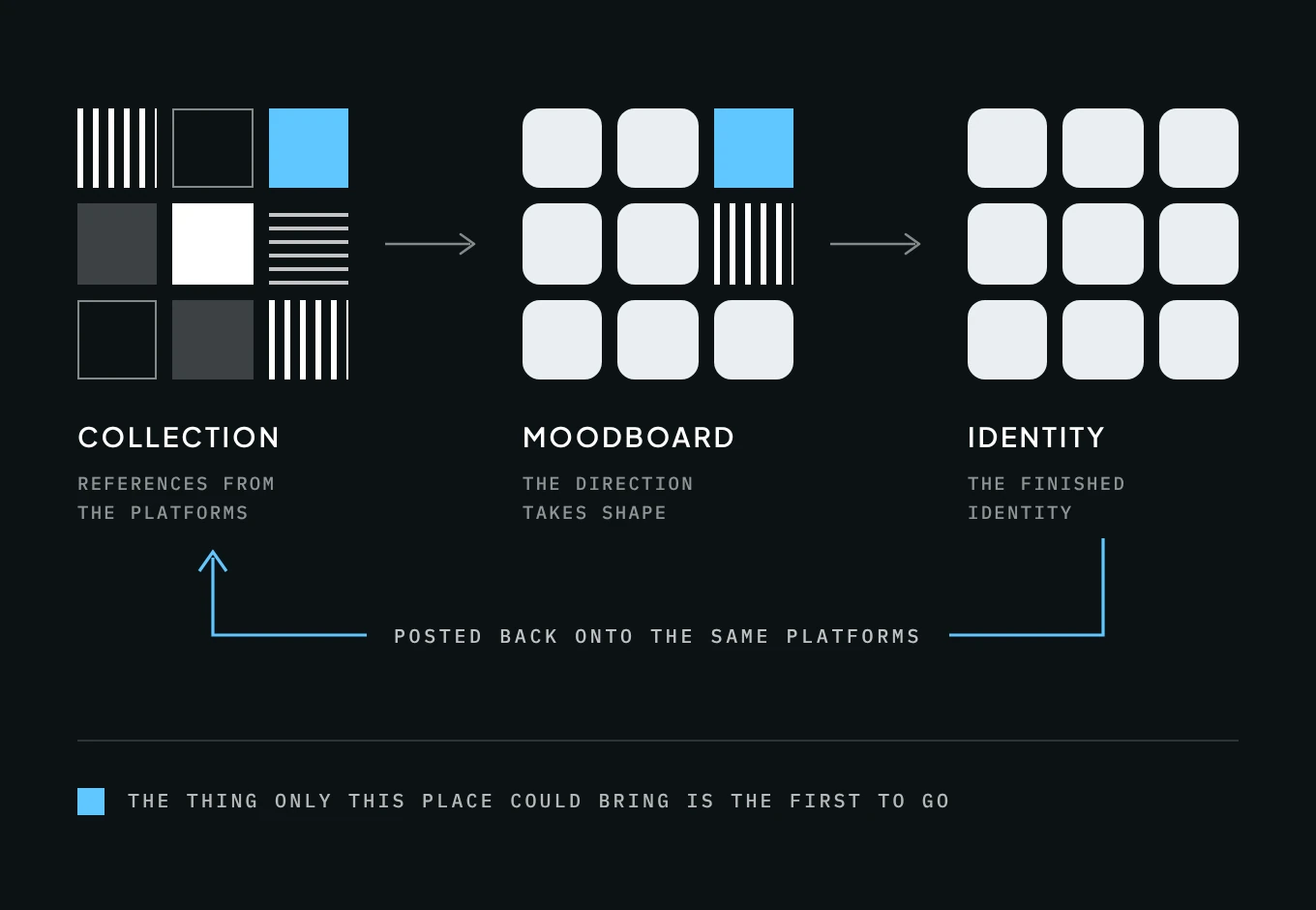
Nigerian designers have the talent. Much of the sameness comes from where our references come from, and the honest truth, as we say here, is that the route is easy to trace because I take it myself. A brief comes in. Before anyone has sketched anything, the first move is to open Dribbble, Behance and Pinterest and start collecting. The collection becomes a moodboard, the moodboard becomes a direction, the direction becomes a finished identity, and the finished identity is posted back onto the same platforms, where it becomes part of the next designer’s moodboard. The platforms rank what they show by what has already been liked, saved and shared, so the images that rise are the ones that already resemble what rose last year. That ranking is itself a design decision, made by product teams a long way from Lagos, and it shapes the taste of designers who will never meet them. In my own studio I build Stylescapes, a method I learned from designers working in North America and Europe, and I still use it because it works. A Stylescape gives a client something to react to before you have committed to a single logo, and the method is sound, so my question is about what we feed into it. If every image on the board comes from the same three platforms, the method will reproduce the platforms’ taste with great accuracy, and the client will approve it because it looks like everything else they have been told looks good.
The clients push from the other side. Most designers here will have heard the phrase in a briefing: “We want it to have global appeal.” I have heard it from founders, NGOs, businesses and people building personal brands, and I understand why they ask. They want investors, partners and customers abroad to take them seriously. In 1983 Paul DiMaggio and Walter Powell described mimetic isomorphism: organisations facing uncertainty copy whoever already looks legitimate. A startup unsure how to look credible to an investor copies the startups that were funded, and the designer it hires copies the shots that were liked. In practice, “global” in that sentence usually means legible to a particular audience in London, New York or San Francisco, and the request rarely travels the other way. Much of the “global” look clients ask for is someone else’s local style travelling outward, Scandinavian minimalism above all. Brands in Copenhagen are not asked to look Nigerian to be taken seriously, and the rest of the world is expected to learn their visual language. African brands are asked to unlearn theirs before anyone has seen it. I wrote about a version of this in the essay on Nigeria, IShowSpeed and the cost of undesigned cultural identity, and the pattern holds in brand design as much as in national image.
In the non-profit world the request is phrased differently. Much of the brand work in the sector is shaped around funders, for good reason, and it is work I do myself, so I have no distance from this. For an African NGO, looking credible to a funder usually means being legible to a programme officer in Washington, London or Geneva, which is a reasonable thing to want and a narrow thing to design for. DiMaggio and Powell call this kind of pressure coercive, because it comes from the organisations a group depends on. They also describe a normative kind, carried by shared training and professional networks, which in design means the classrooms and platforms where most of us learn what good work looks like. An identity built mainly to reassure a funder can end up describing the funder’s expectations more accurately than it describes the organisation.
AI now speeds the cycle up. Image generators and AI website builders are trained on the same kind of imagery our moodboards come from, so they return the average of what is already there, in seconds, for anyone. A founder who once paid a designer to produce something generic can now produce it alone in minutes. When the cheapest output and the most popular output are the same output, everything converges faster.
The wrong fix
The obvious response to all this is to add Africa, and the question is usually asked in good faith. In May, during a rebrand I am working on for a health non-profit that operates across several African countries, the team asked me what a rebrand that feels African could look like. They wanted an identity that would feel at home in every country where they operate, which is a reasonable thing to want. The organisation has years of work behind it and no cohesive visual system, and the way it describes itself no longer matches where it is going. My answer was that there is no single answer to that question. What feels African changes from west to north to east and south, in look and in culture, and there is no universal African design or colour. Each region does have a visual language native to it, built from motifs and glyphs whose roots belong to specific peoples and places, with meanings that change from one culture and context to the next. That answer was the start of the work, and the rest of this essay is my attempt to say what should take the place of the pattern.
The specificity matters because Africa is fifty-four countries and more than a thousand languages, and the visual systems that come with them carry particular meanings. Adinkra belongs to the Akan of Ghana and Côte d’Ivoire, and each of its symbols stands for a proverb or a value. Nsibidi comes from the Cross River region, shared by the Ejagham, Efik, Ibibio and Igbo. Uli is an Igbo practice of drawing on bodies and walls. Adire is Yoruba indigo cloth, much of it dyed in Abeokuta. None of this makes borrowing wrong. Ubuntu comes from the Nguni languages of southern Africa, and the idea it carries, that a person is a person through other people, is taken up across the continent and beyond because people adopt it for what it means. A cooperative built on its members carrying one another could take up Ubuntu honestly, because the idea describes how it works. A Kenyan fintech that borrows Adinkra symbols because they read as “African” is doing something else. It is using a meaning it does not hold as decoration, and it says something untrue about Kenya and about itself, however well it photographs. The test is the one the rest of this essay applies to form: does the symbol hold something true about what is being built, or is it there to look the part?
The continent-wide shorthand most of us have seen, the kente strip along the bottom of a slide or the “tribal” pattern behind a conference logo, fails that test. It reaches for the most recognisable image available and treats recognition as if it were meaning. It is a stereotype, even when Africans are the ones designing it.
Architecture has been arguing about this problem since the early 1980s. In 1983, the same year as DiMaggio and Powell, the architect and historian Kenneth Frampton made the case for a critical regionalism, a term first used by Alexander Tzonis and Liane Lefaivre. Frampton set it against two failures: the placeless international style that looks the same everywhere, and the sentimental vernacular that applies local decoration to a building without understanding why it was there. What he proposed in their place was architecture that takes its cues from the particular climate, light and ground of a site while still using modern means. In those terms, the kente border on a bento grid is the second failure dressed up as a cure for the first. It leaves the box exactly as it was and paints a pattern on it.
Identity as part of the discipline
The platforms, the briefs and the tools explain how the sameness spreads. What lets it spread so easily, I think, goes back to how most of us learned to think about identity, whether in a classroom, in an agency or, as in my case, by teaching ourselves. We treat it as something we design for other people. It is the client’s thing, the deliverable, the brand book handed over at the end of the project. Very few of us learned to treat identity as part of the discipline itself, as something a designer has to work out about their own way of seeing before they can see anything clearly for someone else. Design is supposed to force specificity. A vague claim can live comfortably in a mission statement, but the moment you try to give it form it either holds or it breaks, and that process depends on the designer bringing something specific to the table. I hold to a principle in my own practice, identity before expression, and I apply it to clients far more readily than I apply it to myself. When an organisation has not settled what it is, it borrows a look. When the designer has not settled what they see, they borrow a moodboard. Put the two together and the platform makes the decision for both of them. The pattern is not only Nigerian, but it is easier to see here, because the gap between the references and the place is wider.
This is where difference becomes a matter of expression rather than exoticism or any claim that Nigerian design is better than anyone else’s. A designer’s taste is formed by where they have lived and what they have looked at, and that formation is the one part of the work no platform can supply. I grew up reading hand-painted shop signs and the lettering on the backs of danfo buses. I have watched a whole street fill on a Saturday with one fabric, the same pattern and the same set of colours repeated on every guest, because a family chose its aso ebi. My eye was also formed far from Lagos, through sixteen months of study in Brighton and work that has taken me abroad. Distance taught me how Lagos looks to people who have never been, and how much of what the world is shown as “African” was never made here. Travel is only one route to that kind of range, and not a superior one. As I argued in The Fourth Culture, a designer in Ibadan can absorb Seoul, São Paulo and Nairobi through a phone and be changed by them. What matters is whether those influences are lived with and understood, or simply collected. None of that is a motif anyone can lift onto a moodboard. Every designer carries a mix no one else has lived, and it shapes what they notice, what they keep and what they throw away, which is exactly what a client is paying for when they hire a designer and not a template. A designer’s difference comes from that particular combination of places, people and work, foreign influences included, which is why no platform can supply it ready-made.
The alternative, on a screen
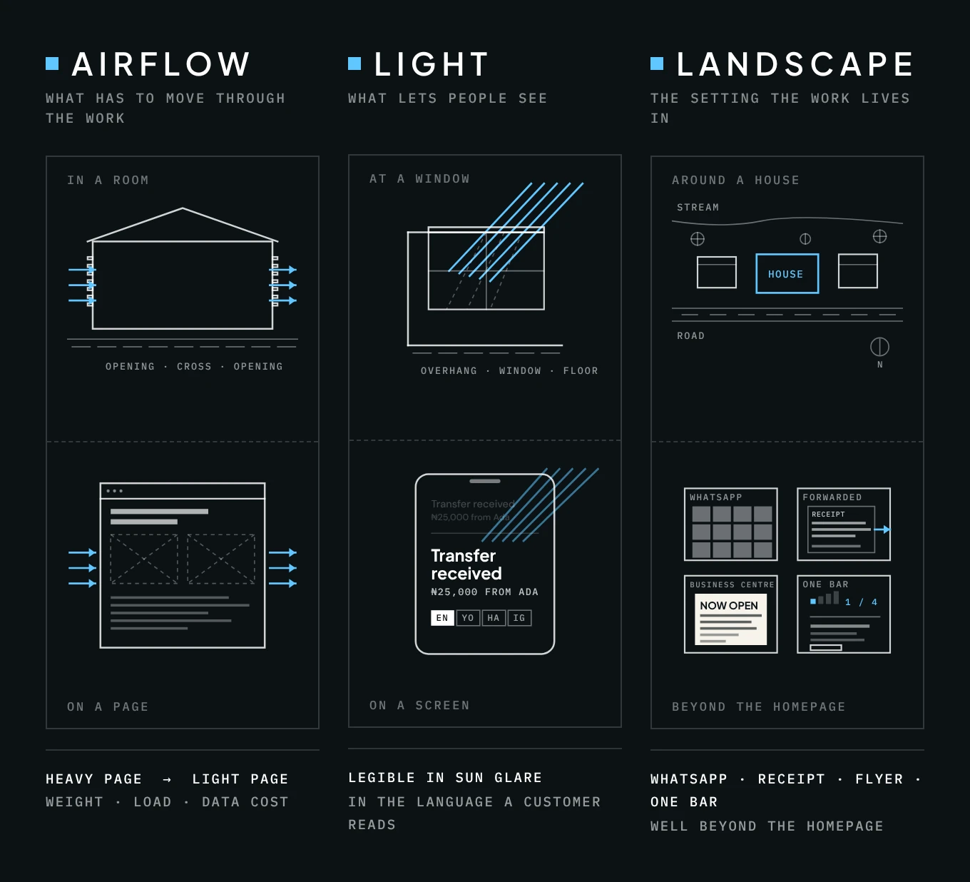
Compound’s three words have changed how I look at my own screens. Airflow, light and landscape are the conditions of a Lagos plot turned into a brief, and none of them can be copied from a photograph of a house in Lisbon. Carried over to an interface, each one becomes a design question that can be tested. Airflow is what has to move through the work: the weight of a page, the time it takes to load, the cost in data of every image a customer did not ask for. Much of this costs little, since a lighter page with fewer images is cheaper to host and cheaper for a customer to load. Light is what lets people see: type that stays legible in sun glare on a dim, low-end screen, and copy written in the language a customer reads. For some customers that language is English, and for others it is Pidgin, Yoruba, Hausa or Igbo, so a receipt that lets them choose serves all of them. Landscape is the setting the work lives in, and for most Nigerian brands that setting lies well beyond the homepage, in the WhatsApp catalogue where the order is placed, the receipt that will be screenshotted and forwarded as proof of payment, the flyer printed at a business centre, the onboarding flow that has to survive a cracked Android with one bar of signal. None of these will trend on Dribbble, because none of them photograph well. They come from knowing the place the work will live in.
Compound is also a business, and heritage modern is part of what it sells. Difference can be packaged into one more look to buy, and the tours themselves guard against that only because they move between a villa on Lagos Island and a one-bedroom flat in Oniru. The flat belongs to the designer Mina Harvey, who uses pink as the neutral that holds every room together, a choice no moodboard of beige would have produced. Neither Ebuka’s apartment nor Mina Harvey’s flat is defined by what it cost. What gives each its character is attention: plants, thrifted pieces, a colour chosen on purpose. Taste of that kind is something people make with whatever they have, and many already do, in the way a single room is arranged, a wall is painted or a fabric is hung.
Treating airflow, light and landscape as design questions has consequences for how the work is commissioned, made and judged. A brief that asks for global appeal cannot be designed against, because nothing could ever prove it wrong. Changing that is easier to write than to do. A small studio rarely gets to refuse a paying client, and the brief is often the only place the conversation can be had. A brief that specifies the customer, the device, the channel and the language can be designed against and tested, and the identity that answers it will look like the organisation because it was built from the organisation’s real situation. References change role in the process too. The street, the client’s own archive and the channels its customers already use set the direction, and the platforms serve the problems of craft. Judgement moves as well, from the studio monitor in the presentation to the phone, the glare and the forwarded screenshot where the work will be met.
I saw a version of this last semester at Mountain Top University. Most of the culturally rooted briefs I set went to my 300 and 400 level students, among them identities for local fashion brands and for street food. I taught them to use Pinterest the way every designer does, to gather references and see what works, and then pushed them past the cliché, to think about each brand in its context, historically and as it lives now. Their moodboards still came from the same places. Even so, several of them made serious attempts to interpret each brand in a way that was locally and culturally relevant, because the context set the direction and the references followed it. For those of us who teach, that is the practical lesson: Pinterest can stay on the desk, as long as a student’s own surroundings are treated as primary research.
Who is already doing it
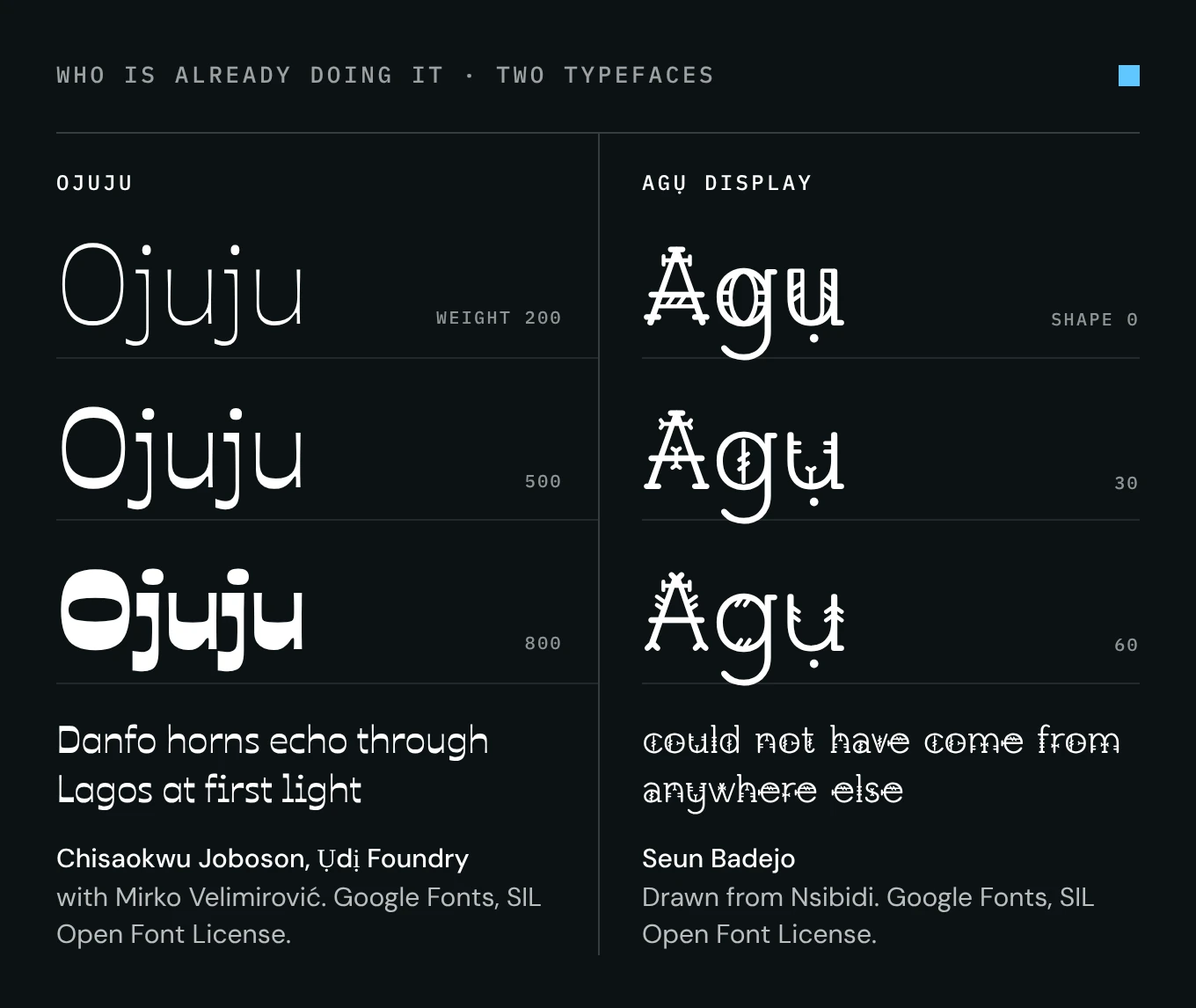
Some Nigerian designers are already doing this work seriously. Chisaokwu Joboson runs Ụdị Foundry in Lagos, which describes itself as an independent type foundry creating African fonts for global use. His typefaces, among them Ojuju, Gidigbo and Oja Display, draw on Nigerian letterforms and cultural memory, and the specimen on the foundry’s new site is set in a line about danfo horns echoing through Lagos at first light while market women bargain beneath bright ankara skies. He has taken that work to ATypI, the international typography conference. Seun Badejo built Agụ Display from Nsibidi and released it through Google Fonts, which means a designer anywhere can now set a headline in letterforms with roots in Cross River. Compound is doing the equivalent for homes, one tour at a time. Each of them started from something they knew from the inside, long before any search bar, and then did the slow technical work of making it usable. The danfo and the ankara can become a moodboard too, which is why that technical work matters more than the imagery.
I still build Stylescapes. I still open Behance, and I will probably open it this week. None of this exempts me. I am questioning my own practice as much as anyone’s, from where the first references on a board come from to what I test a design on before a client sees it, and I am still working out what to change. The frameworks can stay, and kente borders would answer nothing. What I am asking myself before the next brief, and what I would put to any designer reading this, in Lagos or anywhere else, is a simpler question: what are you making that could not have come from anywhere else?
References
Essays and Articles
DiMaggio, Paul J. and Walter W. Powell. “The Iron Cage Revisited: Institutional Isomorphism and Collective Rationality in Organizational Fields.” American Sociological Review 48, no. 2 (1983): 147–160.
Frampton, Kenneth. “Towards a Critical Regionalism: Six Points for an Architecture of Resistance.” In The Anti-Aesthetic: Essays on Postmodern Culture, edited by Hal Foster. Bay Press, 1983.
Tzonis, Alexander and Liane Lefaivre. “The Grid and the Pathway.” Architecture in Greece 15 (1981).
Data and Reports
GSMA. Entry-level smartphone affordability in Nigeria, 2024 (report published December 2025), as reported in “Nigeria Renews Push for Local Smartphone Manufacturing Amid Affordability Challenges,” Ecofin Agency, 1 July 2026.
Digital Projects
Compound and CRAFT, Lagos 1st Edition (2026).
Chuka Okonjo, LinkedIn post on Compound’s Builders of Modern Lagos feature, Arise News.
Agụ Display, via Google Fonts.